(American release):

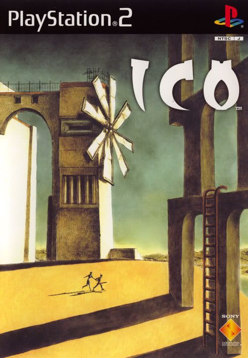
(Japan/Europe release):

Notice anything strange? Notice how the game that was released for Japan and Europe has the greatest cover art of all time. It's a direct homage to de Chirico.
When I see that box art, I want to buy the game. The composition has an unusually subdued color scheme, which makes it immediately interesting. The image places you in a plausible yet still bizarre architectural setting. The setting is grandiose but eerily devoid of life. The place seems ominous and daunting, but only ambiguously: there aren't any direct or visible threats anywhere but you want to flee it all the same. The visuals give you no clue about who you are. Instead the entire focus is on WHERE you are. And wherever that is, the obvious key is that you don't want to stick around, and more importantly than that you have more than just yourself to look out for.
Notice how the game that was released for North America has some of the worst box art I have ever seen. It has no ambience. It has no atmosphere. It's a jumble of amateurish superimpositions. The focus is on the hero, who appears to have no personality whatsoever. The scenery has no emotional or artistic significance whatsoever. The visuals tell you precisely who you are but absolutely nothing about where you are or what you're doing.
So even though I believe Ico had the greatest box art I've ever seen on a video game, the business people don't want me to buy it. In a different era, you might suppose that the publishers want to market not to people who would recognize a di Chirico painting, but instead to either children or to parents who know almost nothing about videogames but who might buy a game for their child on impulse if they see a playful/combative character on the box (which the bastardized US box art displays). But this is the age of the internet, and even before the internet, kids who played games read game magazines, and knew what they wanted, box art be damned.
Example 2: Mirror's Edge
Here's the Mirror's Edge cover art (at least in North America):

Now here is a piece of concept art that developers made at some point in their creative process:

Now THAT would have been way better covert art. The face cover tells you nothing-- except that the heroine is some kind of corny badass with an eye tattoo. But the city-scape cover tells you EVERYTHING. It tells you that your heroine is dauntless. She's casual and assured even when she's standing 60 stories over the street. It tells you what your mission is: to traverse those rooftops, at dangerous heights, and to deliver that yellow pouch. It puts you in the aesthetic of the game, which is oddly sterile looking white architecture with bold splashes of primary colors. (It could be better if Faith (the heroine) was running instead of standing at ease, since she's a parkour courier, but that's OK. The way she's at ease communicates just as much.)
The Batman movies, and the Batman animated series often used a similar shot of Batman standing high on a skyscraper or gargoyle, watching over the night-time city. They never show you a pointless and inscrutable close-up of Batman's face, since that is boring and tells you nothing.
The insistence on showing pointless character shots, without any situational context or setting, is a weird trend. It's dishonest because it's uninformative and inaccurate. It's pretentious because it tries to suggest that there's something truly appreciable about the character's face, when in fact there isn't anything appreciable-- the marketers/developers are just being fools. Furthermore it's an unartistic cop-out because it does not convey anything at all about the vision of the game. And further still, it's contradictory because as much as the developers want a "character-driven!" image or story and therefore attempt to reveal the nature of their character with a useless face shot, they still refuse to hire competent voice actors and voice directors (and dialog writers) for their characters.
Example 3: Exiled
This is a movie, not a game. But bear with me.

What is that garbage? Well, that garbage happens to be a promo shot of one of my favorite movies of the last few years. Here's what it looked like over in the eastern hemisphere:

Notice anything? Yes, that's right. The first one sucks. Somebody stop the madness.